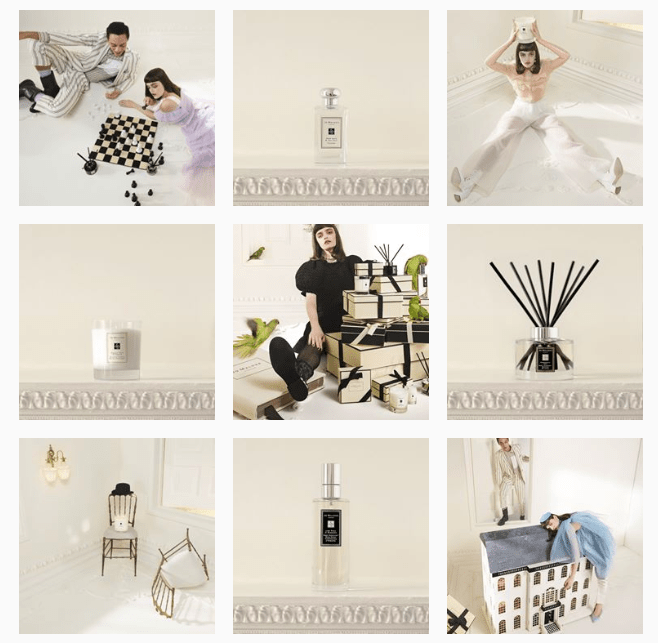
One of the most important things that will create loyalty and attract new followers is the consistency of the content you publish on social media.

When it comes to visual consistency, there are a few key elements that make a huge difference. These elements will greatly be appreciated by your audience and worth implementing.
What creates visual consistency? Think of fonts, colours, formatting, use of logos etc.
Colour Scheme
One of the best things you can do to make your post pop is to use a neutral background so that what’s actually important, pops.
If you’d like to use dark colours, you can get away with it by complimenting them with white.
Only choose one dominating colour that will be the most used one in your posts. You can then play around with the shade slider to come up with hues that compliment it. For example, if your primary colour is burgundy, you can add more pastel colours like a dusty pink or a pearly grey.
Or if you’re looking for more vibrancy, use bright colours that always go with each other. Think of blue and yellow.
Pro Tip: Take inspiration from your logo and website.
Here are some great example of visual consistency within a colour scheme:


Source of images: later.com
Font
Even viewers without a critical eye will immediately notice if your post yesterday used Abril Fatface and the one today used a simple font like Open Sans.
The best thing to do is set your mind on three or four fonts you like. But remember that they need to go together before you start combining Anton and Benedict.
Pro Tip: What I always do when coming up with fonts for different social media campaigns is to add the fonts I use in a separate box in my content calendar. This way you can always go back to it and make sure you’re staying consistent.
Examples of fonts that work well together:
- Viga and Oxygen
- Futura and Souvenir
- Helvetica and Garamond
- Playfair and Source Sans
In the end, just like with colours, you need a dominant font you’ll be using for headlines and a more simple on to use for your text. You can choose a third and fourth for accompanying elements to a post.
Format
The third element of achieving visual consistency is the formatting you do when you design posts. Have you noticed where you place your text? Where do you position your logo?
What you can do is create a rough template or a couple, in which you have the usual positioning of texts, imagery and logo.
You also need to think about the size of the features. Do you normally enlarge your image and use it as the focal point? Do you incorporate the text within the image or do you place it in a separate box?
When you have these planned and you’ve created a template, you will save a lot more time when establishing a new campaign.
Use these tactics to achieve one of the most important elements of social media marketing: consistency.

Leave a comment